PeopleOS AI
An AI-first HR platform for African teams — one design system, three products
- Services
- Product Design · Design Systems · UI/UX · Motion Spec
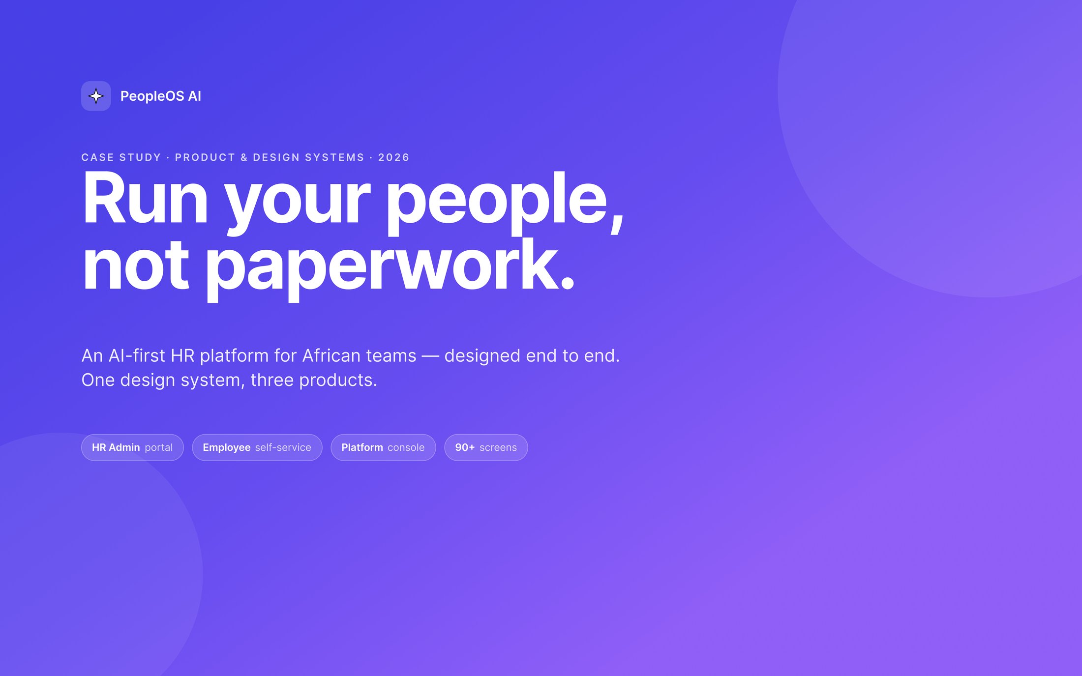
Payroll, people andperformance — oneproduct, three audiences.
An enterprise HR platform designed for the African market rather than localised into it afterwards: Naira, PAYE, Pension and NHF, Paystack and Flutterwave, Lagos time — present from the first screen instead of retrofitted.
Four connected things came out of it: a production-grade design system, an HR Admin Portal, an Employee Self-Service app for desktop and mobile, and the internal Platform Console that runs the business behind it.
- Role
- Sole product designer
- Scope
- Design system · 3 surfaces
- Screens
- 90+
- Tools
- Figma
- Year
- 2026
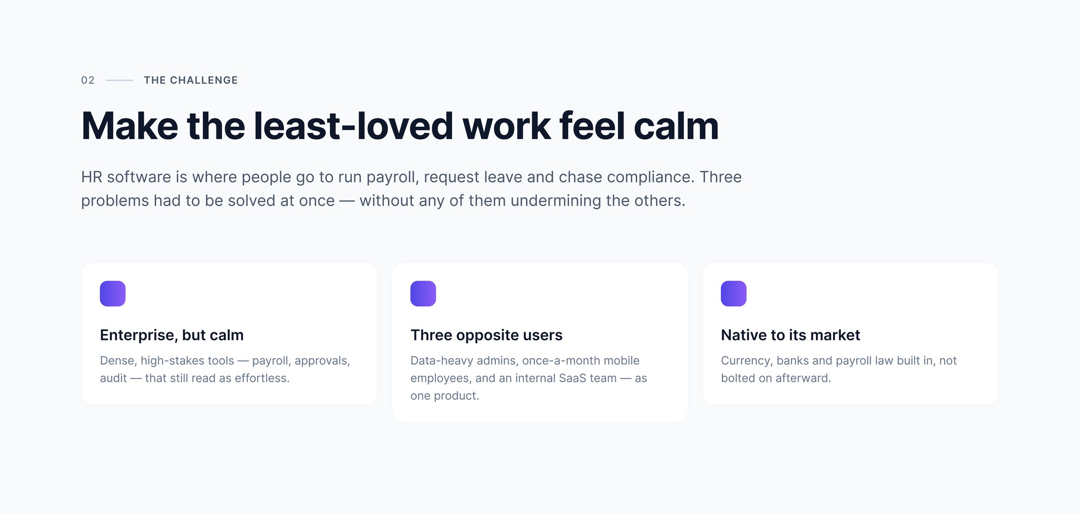
The challenge
Three problems that undercut each other.
HR software is where people go to run payroll, request leave and chase compliance — dense, high-stakes work that most tools make feel heavier than it is. It had to stay enterprise-grade and still read as effortless.
Meanwhile the same product serves a data-heavy admin at a desk, an employee opening it once a month on a phone, and an internal SaaS team watching the platform itself. Solve any one of those in isolation and you break the other two.
Foundations
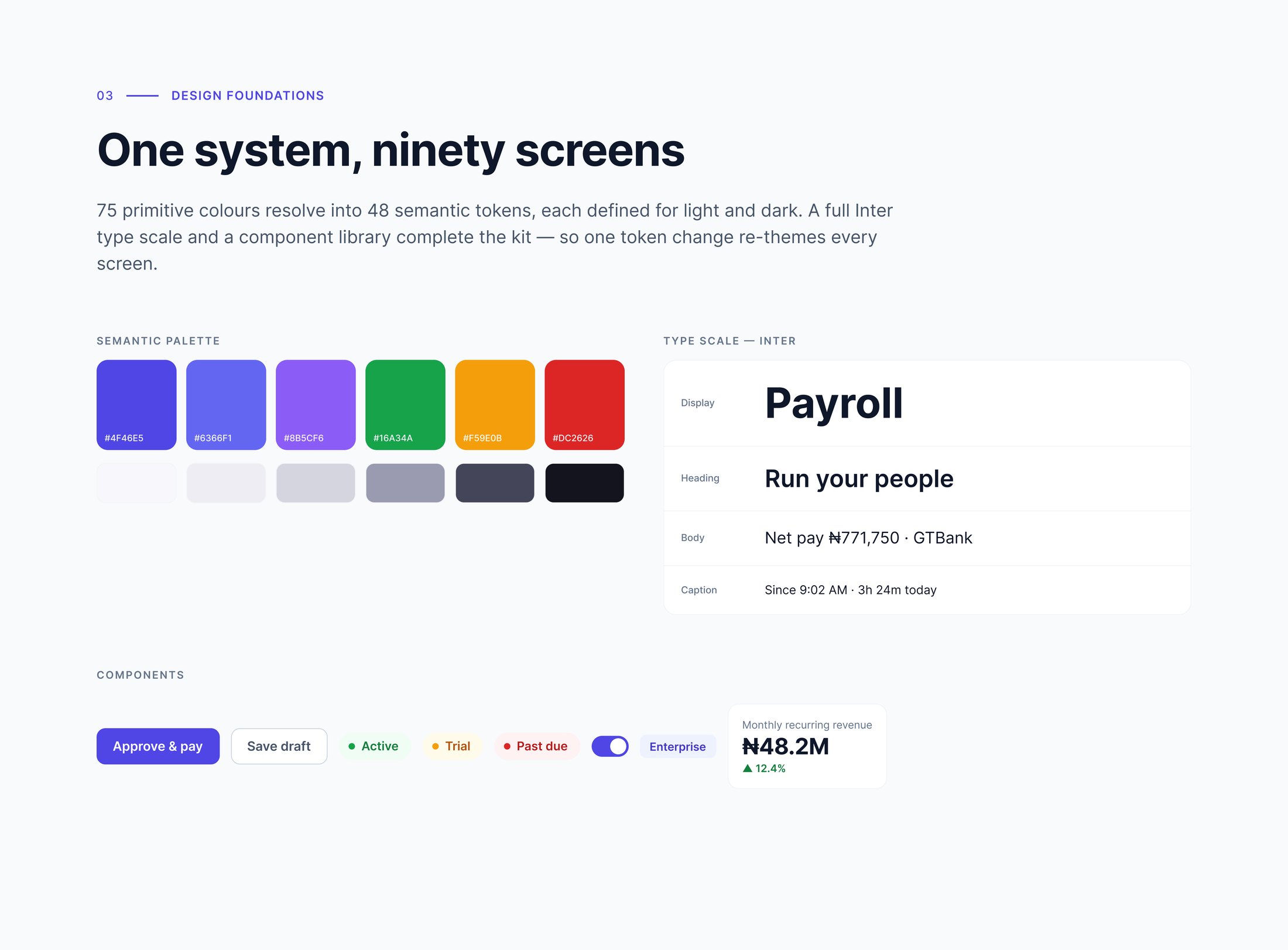
Seventy-five primitives, forty-eight decisions.
The primitives are raw values; the semantic tokens are the decisions made about them, each defined twice so light and dark are one system rather than two files. A full Inter scale and a component library sit on top.
That layer is the reason a single token change re-themes every screen — and the reason three surfaces that look nothing alike never drifted apart.
Surface 01 · Customer
Where the month actually gets closed.
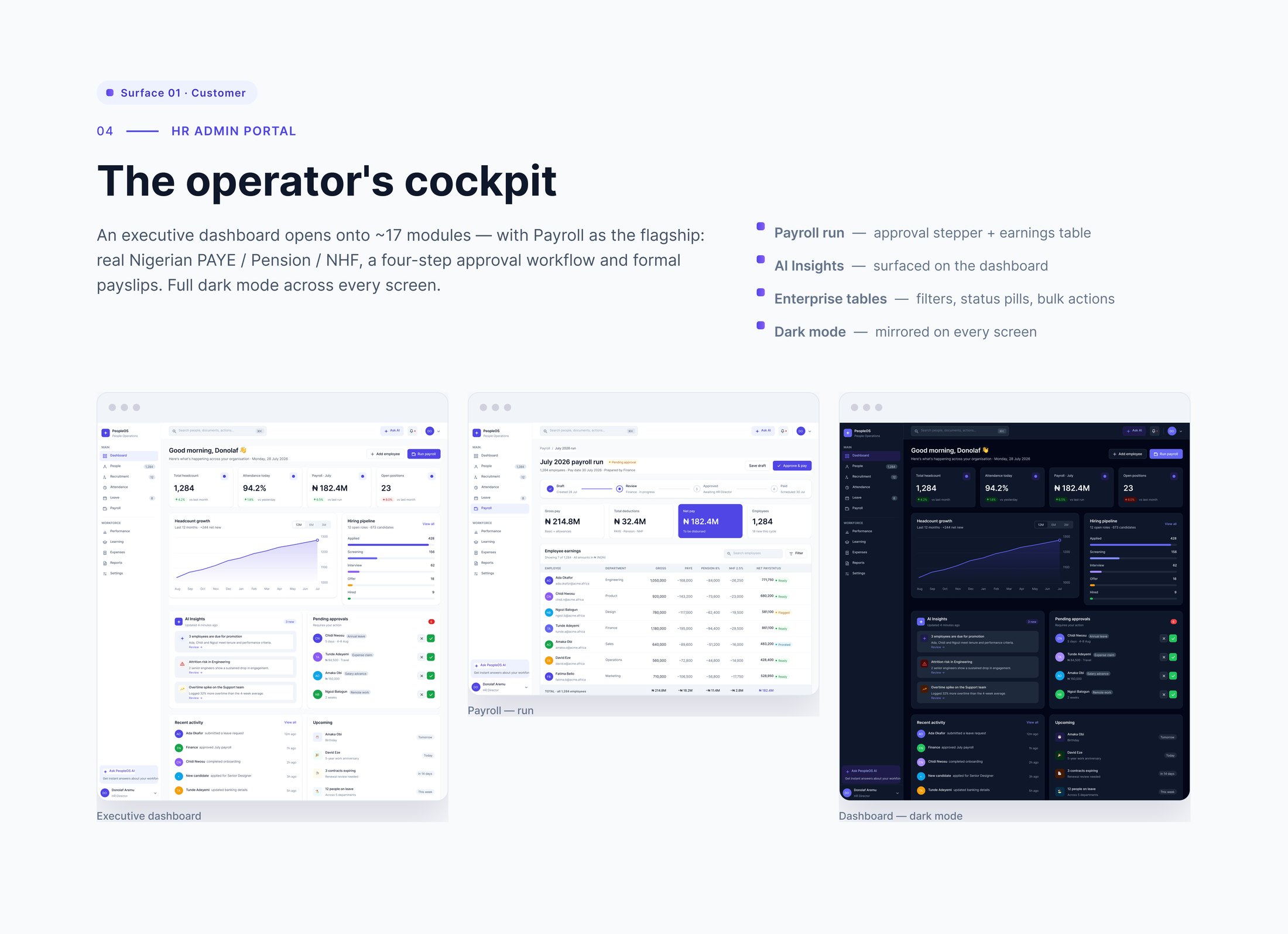
The admin portal opens on an executive dashboard and fans out to roughly seventeen modules, with payroll as the flagship: a four-step approval workflow, real PAYE, Pension and NHF deductions, an earnings table built for scanning, and formal payslips at the end.
AI insights surface on the dashboard rather than hiding behind a chat box, and dark mode is mirrored across every screen instead of being an afterthought toggle.
Surface 02 · Customer
Once a month, on a phone, in a hurry.
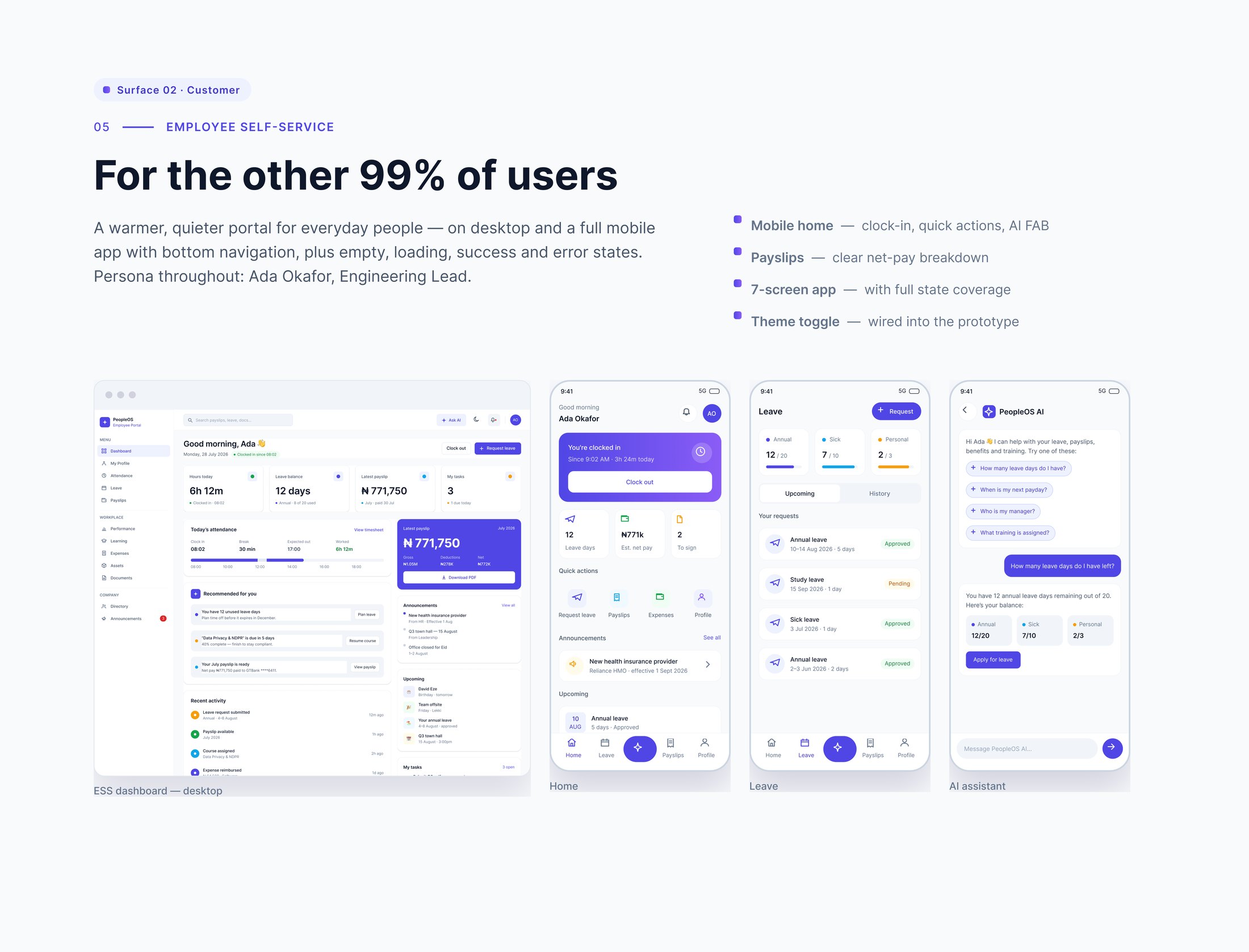
Most people touch HR software to do one small thing and leave. So the employee side is warmer and quieter: clock in, check a payslip, request leave, ask a question — on desktop and as a full mobile app with bottom navigation.
Empty, loading, success and error states are drawn rather than assumed, because for this audience an edge case is usually the whole session.
Surface 03 · Internal
The tool that runs the tool.
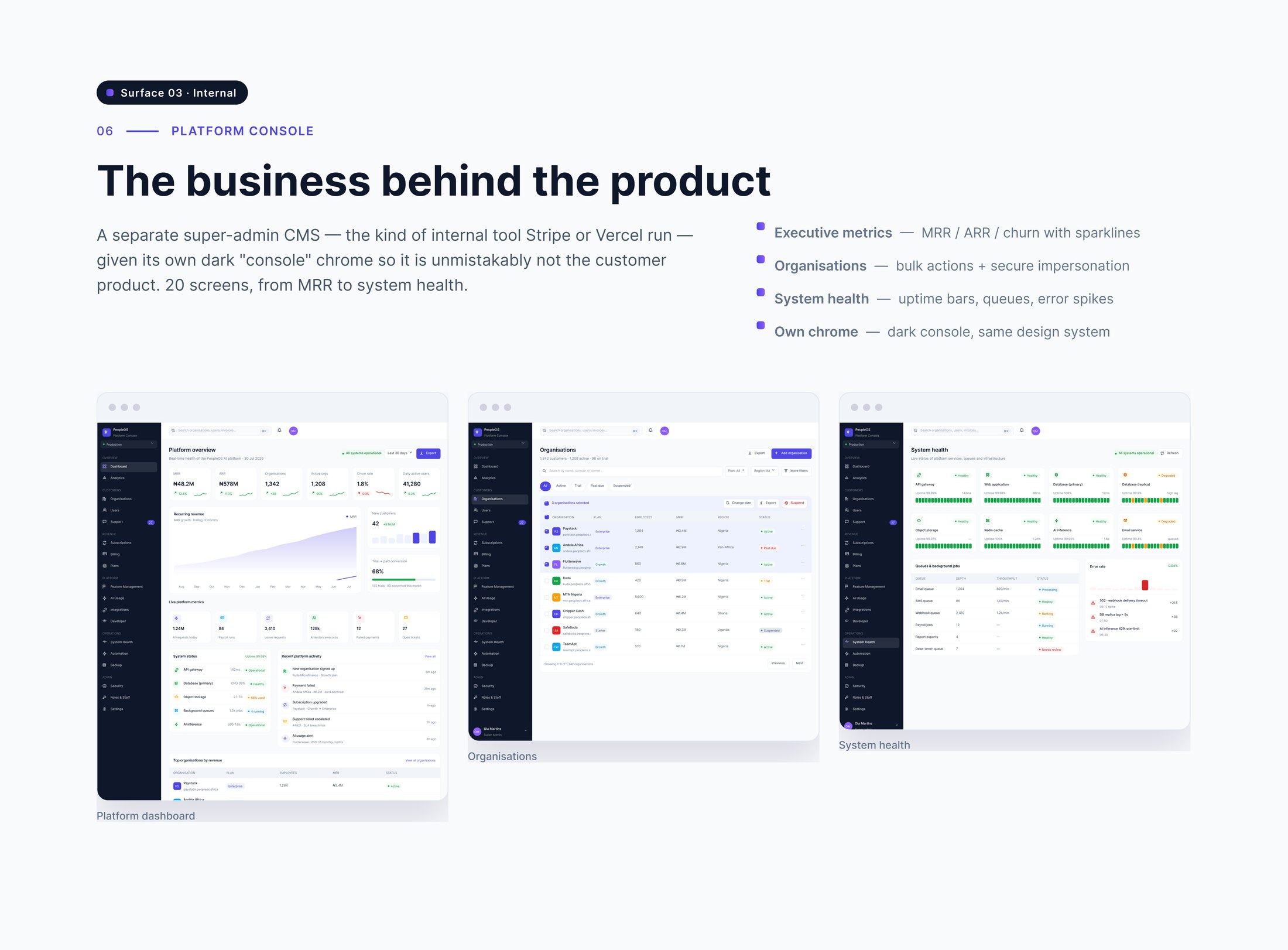
A separate super-admin console — the sort of internal product a platform team lives in — covering revenue, tenant organisations, support and system health across twenty screens.
It was given its own dark console chrome deliberately, so nobody can mistake it for the customer product, while still being built from the same tokens and components.
Motion
Motion specified, not described.
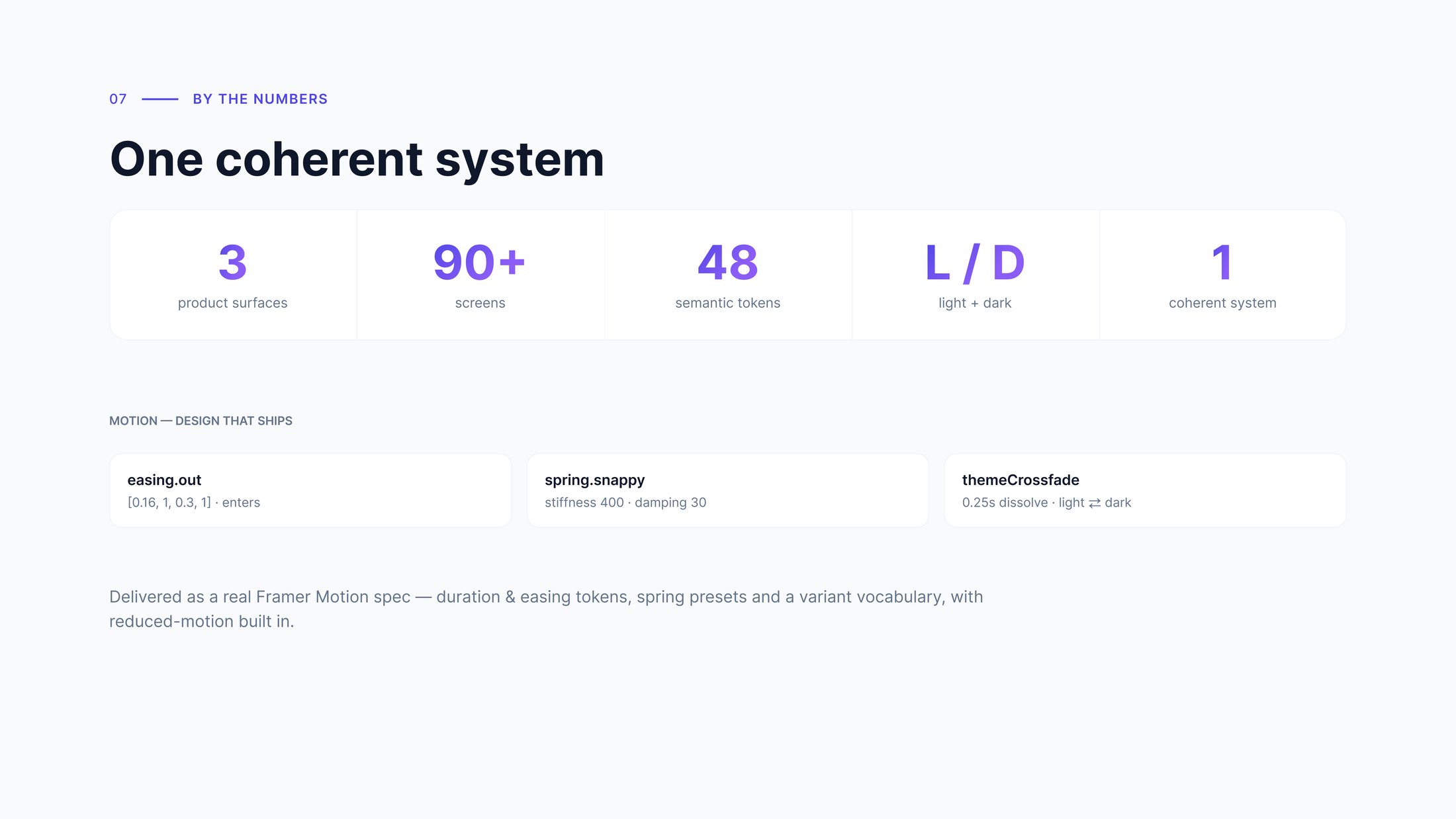
The handoff includes a real Framer Motion spec rather than a paragraph of intent: duration and easing tokens, spring presets, and a variant vocabulary a developer can implement directly.
Enters run on easing.out [0.16, 1, 0.3, 1]. Interactions use a snappy spring at stiffness 400, damping 30. Theme changes cross-fade over 0.25s. Reduced motion is built into the spec, not bolted on after.
The hardest problem wasn’t any single screen — it was making three audiences with opposite needs feel like one product.
Reflection
The foundations are what let one designer ship an ecosystem.
Shared tokens and components mean the internal console and the employee mobile app read as the same family even though they look and behave nothing alike.
That is the whole return on building the system first: the surfaces could diverge as far as their users needed without the product fragmenting.
Credits
- Product Design
- OLAF Studio
- Design System
- OLAF Studio
- Motion Spec
- OLAF Studio
Next project
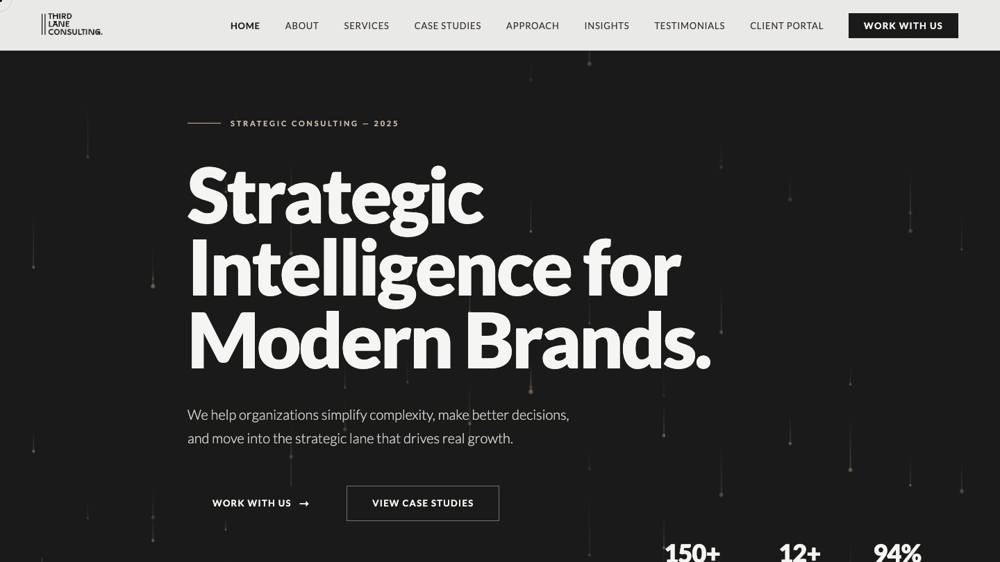
Third Lane Consulting
DIGITAL / DESIGN2025Third Lane Consulting