Identity System 2026
A studio identity built to behave like a system, not a stamp
- Services
- Brand Design · Design System · Art Direction · Motion Identity
- Client
- OLAF Studio
The framework stays consistent.The projects are wherethe experimentation happens.
OLAF needed an identity that could carry a film title card, a club kit, a case study and a hiring post without any of them looking like a different studio made them.
So the system was designed as a set of rules rather than a set of layouts: a fixed mark, a monochrome foundation, three typographic voices and a green that swaps like a colour mode.
- Discipline
- Design
- Year
- 2026
- Signal
- Caribbean
- Deliverable
- 20-page guideline + Figma library
The variable
No single green is the brand. The range is.
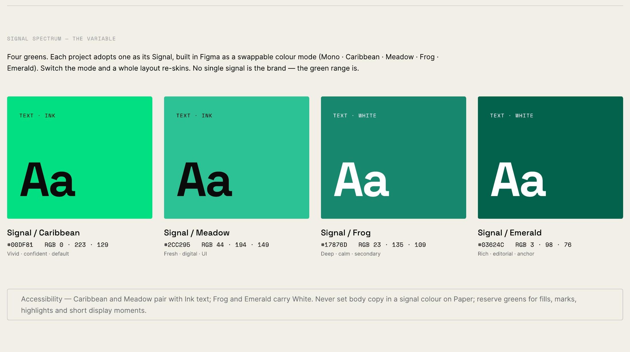
Each project adopts one signal as a swappable colour mode. Switch the mode and a whole layout re-skins — the same structure, a different temperature.
The constraint that makes it work is restraint: colour is an accent, never the surface. Ink on warm Paper carries every layout.
Neutrals — the constant
- Ink / 900#0A0A0B
- Ink / 800#18181B
- Ink / 700#2C2C31
- Grey / 500#6B6B72
- Grey / 300#C7C6CC
- Paper / 100#F2EFE6
Signal spectrum — the variable
- Caribbean#00DF81
- Meadow#2CC295
- Frog#17876D
- Emerald#03624C
One signal per project. Switch the mode, the layout re-skins, the monochrome underneath never moves.
The toolkit
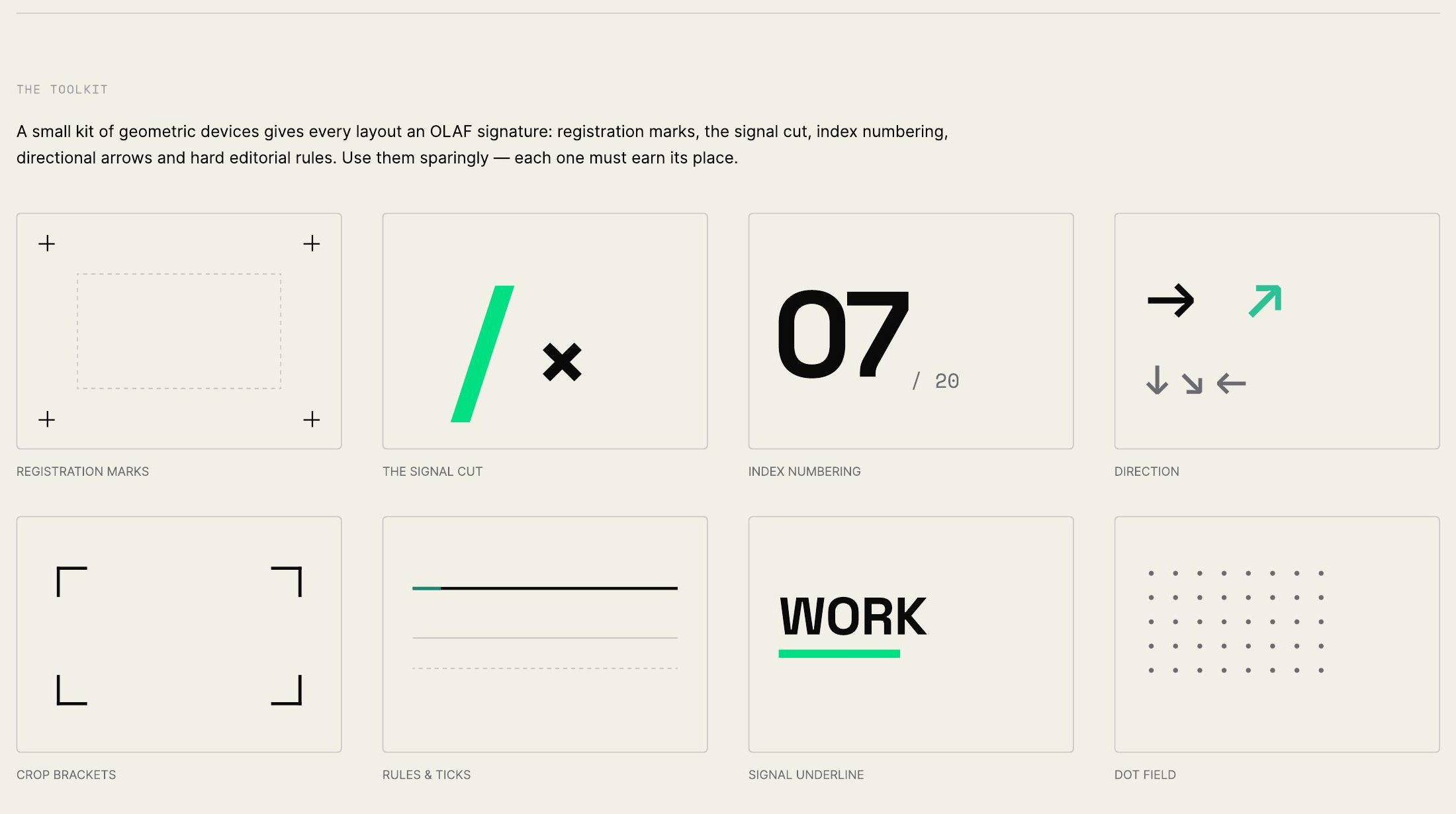
A small kit of devices, used sparingly.
Registration marks, the signal cut, index numbering, directional arrows, crop brackets, hard rules and a dot field. Each one has to earn its place in a layout.
They are the through-line: whatever register a piece is speaking in, the same small vocabulary is underneath it.
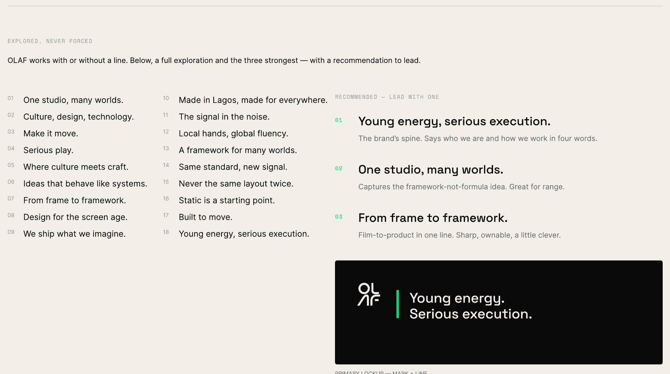
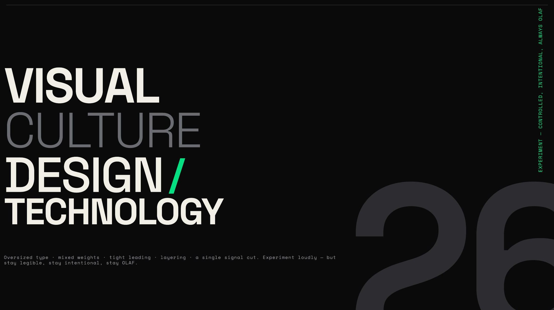
Young energy. Serious execution.
The line that survived
Credits
- Creative Direction
- OLAF Studio
- Identity Design
- OLAF Studio
- Design System
- OLAF Studio
Next project
NOMA Service
DIGITAL / DESIGN2026NOMA Service Consolidated Limited